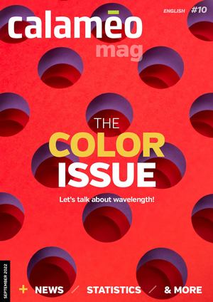
CALAMEO MAG ENG #10 - SEPTEMBER 2022
Enjoy the Color issue of Calaméo Magazine!
ENGLISH #10 mag THE COLOR ISSUE Let’s talk about wavelength! SEPTEMBER 2022 NEWS STATISTICS & MORE 1
TRY ALL OUR FEATURES FOR 14 DAYS START YOUR FREE TRIAL 2
FROM CONCRETE TO ABSTRACT The beautiful days of vacation are over, and those of back to school have arrived. Nature, in its perpetual cycle, will progressively cover its sun-tinted summer dress with its reddish colored autumn coat, waiting for next year. This approaching change of season inspired the Calaméo team to choose the theme of CALAMÉO MAG this new issue: colors. Director Jean-Olivier de Bérard Sometimes a marketing tool, sometimes Editor in chief an artistic one, colors are an integral part Chloé Jouanne Editor of our lives in every way imaginable. Thus, Elizabeth Dulcich we often talk about color psychology, Design Ana Beatriz Avolio wavelength, or impressionist painting: Cover image these are all subjects, concrete or Catherine MacBride/Stocksy abstract, among many others, that are related to colors. We’ve prepared a new issue full of surprises: marketing tips on the use of color, a focus on the color blue, tips for creating your graphic charters. We’ve even created a special “color” playlist. So, from blue to yellow, and from green to pink: let’s take this opportunity to celebrate all shades and colors. HAPPY READING! 3
CONTENTS DISCOVER OUR PLAYLIST 5 STATS Colorimetry 6 NEWS 8 SPOTLIGHT Blue 14 CREATIVITY CORNER Brand style guides at a glance 18 TIPS Shades and sensibility 20 MOODBOARD La vie en rose 22 PICKS Rainbow 4 ovium Anter
STATS COLORIMETRY Colors have an outsize impact on brands, products, and consumers. In fact, consumers tend to make up their minds quickly about products and brands, just based on color and visuals alone! To shed more light on the importance of colors in branding, we have selected a few key facts and figures to share with you. 40% Fortune 500 2/3 companies that use shoppers who will blue in their logos not buy an appliance if it does not come in Daily Blogging their preferred color Truelist 41 different shades of blue that Google tested for their ad links SuperDataScience 90 seconds time it takes 85% for consumers to shoppers who are make an initial influenced by color when judgement about a buying a product product or company Neil Patel Tailor Brands Mae Mu 5
NEWS Musicman80 BLOG CALAMÉO This summer, the blog SUGGESTED FOR YOU celebrated literature. [Infographic] All about We’ve featured articles book clubs about reading and writing: activities we’re passionate Digital publishing for your book club about at Calaméo. So, if you haven’t read them yet, 4 reasons to read on take a look at our most Calaméo recent articles. Write and publish your short story Write and publish your novel 6
TUTORIAL UPDATE We’ve updated our tutorial on how to use Social Media as a content creator: a great guide for beginners! (Re)discover the tutorial New Africa Alex OUR BOOK CLUB As you may have noticed, we have changed the categories of our NEW FEATURES blog. We have chosen to dedicate a section of the blog to literature The Calaméo team has lovers: readers and authors alike. some great new features Check out the “ Book Club “ coming soon on our website, category on the Calameo Blog to stay tuned! read all the latest articles and tips on the subject. Browse the category 7
LA LOUPE ASPOTLIGHT BLUE In graphic design, the color blue is everywhere to be found. It is even the most popular color for logos. So, from turquoise to sapphire, from cobalt to azure: how can we explain the ubiquity of the color blue? 8
LIGHTFIELD STUDIOS 9
SPOTLIGHT AnnaPa MORE THAN A PRIMARY COLOR The additive color model As we learned early on at school: blue is a primary color. However, it’s not quite that simple. In the additive color model, which is used to define the colors diffused on our screens on websites and Stimmungsbilder1 The Venus of Alexandria digital communications, blue is indeed a (Venus Blue), by Yves primary color. Yet for printed materials, Klein, 1962 the primary blue shade used is actually a cyan tint (a greenish blue). The printing industry uses the subtractive color model. Elephant sculpture in Blue is a chromatic color, composed of lapis lazuli, Mughal hundreds of shades between green and art (1526-1827) violet. Although blue is considered a cool color, shades of blue can be warmer or cooler depending on their undertones, brightness, and saturation levels. Adrian Pingstone 10
Viault The Majorelle Garden, Marrakech, Morocco tho ma The Starry Night, by Vincent van Gogh, 1889 A FASCINATING COLOR Blue is rarely found in nature, and only been created in the Middle Ages! natural blue pigments are therefore This shows how captivated we are by scarce. As a result, civilizations quickly the color blue. learned how to create synthetic blue In art, blue can be found in many works pigments. The first of these was such as Van Gogh’s Starry Night, for invented in ancient times, called example. Fascinated by this color, some Egyptian blue. However, it is interesting artists even invented their own shade, like to note that at that time, the color blue Jacques Majorelle or Yves Klein. Others hadn’t been invented yet, research use blue in their works to express their found that its name and concept had sorrow, like Picasso during his blue period. 11
SPOTLIGHT ho ak in al BLUE HAS NEVER LEFT ANYONE COLD In ancient Rome, blue was despised. Seen as a symbol of ridicule and associated with barbarians: you could not wear blue. From the Middle Ages, Logo of the the color took on a divine connotation, Domocrat party and it started to appear on many religious works of art. It then became the color of the monarchy (of divine rights) a little later. Finally, in the 20th century, the whole world embraced the color blue when blue jeans came into fashion. According to the times and cultures, the feeling and connotations associated with blue are not the same. Here are some examples of the different perceptions BillionPhotos.com associated with blue: confidence, security, eternity, calm... But also: royalty (Europe), the Democratic Party (USA), The blue jean has been a wardrobe essential since mourning (Iran)... the 20th century 12
ManuPadilla Ikea’s brand identity is unique and recognizable Je re m IN GRAPHIC y Be za DESIGN ng er Companies often use blue in their communications and in their logos. The reason is simple: blue is the world’s favorite color. Brands are sure to Twitter, like many other appeal to most people by choosing this internet brands, uses the color color. Moreover, blue is perceived as blue for its brand identity a positive color by our society, which gives a positive brand image to the brands that use it. Blue is also widely used in brand identity and graphic design because it is the color least affected by color vision disorders, thus To learn more information ensuring a good user experience for about the color blue, read the the greatest number of customers. full article on our blog 13
CREATIVITY CORNER BRAND STYLE GUIDES AT A GLANCE A brand style guide is a document that governs all the visual (and sometimes editorial) elements of a company that make it recognizable and unique. It also explains when and how to use these elements. Simply put, a style guide is the key to all communications! Using the guide as a reference, all company communications are consistent across channels and mediums. Length and details may vary depending on the company, but a brand style guide is usually made up of the following visual and editorial elements: Images by Yash Bindra / Unsplash 14
15
CREATIVITY CORNER 1. LOGO Logos are images, texts, or shapes (or a combination of the three) in the company’s color palette that represent the company. A company’s logo cannot be used haphazardly. The brand style guide should explicitly outline the exact colors and dimensions of the logo. Even the background on which the logo appears is specified in the style guide. 2. 3. TYPEFACE COLORS Typeface is the kind of lettering used Companies have specific brand in communications, which includes colors, usually two to three, that fonts. Does your company use only they use in logos and branding, plus lowercase letters? All capitals? You complementary colors. These colors all must include the size, spacing, and together are known as the company’s color of your typeface in your style color palette. The guide should include guide so employees know exactly how a visual representation of the colors the typeface should look. Some brands and HEX and RGB formats. Companies even create their own fonts! Keep in choose very specific shades of colors mind that your typeface also reflects that go well together and set them your tone– is it silly, serious, elevated? apart from other brands. These exact Your typeface must work well with the shades need to be used every time. other elements of your style guide. 16
5. 6. IMAGES TONE Some brand style guidelines include Your tone and voice give your brand a rules about styles of images or personality via the written word. Once photographs to use. These images must you decide who you are, it should be fit into the brand’s identity and remain easy to find your company’s tone. The consistent; you should not use a bright brand style guide may include different and airy photograph one day and then instructions depending on the channel– a dark and moody photograph the next. perhaps your social media tone will be The rules could include using colors from slightly less formal than that of your the company’s color palette or desired advertisements, for example. The guide reactions that the images should evoke should include written examples so (energetic, powerful, soothing). employees can see how to employ the tone in different situations. Think of the image you want to project, and 4. stay consistent. ICONS Brand style guides may also include illustrations or icons. Consider the icons you see on a company’s website: a shopping cart to click on when you are ready to purchase or an envelope icon if you want to communicate with the company via email. These icons must be coherent across all platforms. Icons will, much like the rest of the elements of the style guide, reflect the brand identity. Whimsical, rigid, colorful, playful…your icons can express a lot about your brand! 17
TIPS SHADES AND SENSIBILITY WHITE BLACK GREY Cleanliness, Power, Neutrality, purity, spaciousness, luxury, mystery, practicality innocence intelligence YELLOW GREEN Happiness, Nature, laughter, optimism, wealth, sustainability, attention-grabbing growth 18
Did you know that colors are linked to emotions? For companies, great thought and care go into their brand color palette. There are even psychological tricks behind choosing certain colors that the company wants associated with the brand or product! But before choosing your company colors, make sure to do your research. In some cultures, black is the color of death and mourning, and in other cultures, white is the color of death and mourning! PINK RED ORANGE Gentleness, Confidence, Happiness, romance, passion, energy, energy, warmth, love intensity stimulation BLUE PURPLE Stability, safety, Royalty, wisdom, calm, trustworthiness, sophistication, loyalty spirituality 19
ijk Tirza van D MOODBOARD ck Alex Blo “Why would anyone pick blue over pink? Pink is obviously a better coloR.” Nik_Merkulov KANYE WEST LA VIE 20 EN ROSE
Henri Meihac E “NOT ONLY CAN COLOR, WHICH IS UNDER FIXED LAWS, BE TAUGHT LIKE MUSIC, BUT IT IS EASIER TO LEARN THAN DRAWING, WHOSE ELABORATE PRINCIPLES CANNOT BE TAUGHT.” M ar EUGÈNE DELACROIX iy an a M Designecologist PABLO PICASSO “Colors, like the emotions.” the changes of Alexander Shatov features, follow Taylor S impson mi keb rau 21 ne
PICKS RAINBOW Discover our special selection, which shows how each color can be a great source of inspiration: it can be used as a book title, in a play on words, or to make a great cover design. ST JOSEPH MEDIA MIDLANDS GOLFER SHAMBHALA And the fact is: we just MAGAZINE PUBLICATIONS loved the blue cover. Green is your favorite? Go on a spiritual and View more Discover the latest literary journey and issue of Midlands explore the classical Golfer Magazine. Chinese and Japanese View more practice of koans. View more Share your favorite publications with us on Twitter @calameo 22
MAKE OUR VIEWER YOURS. PUBLISH IN WHITE LABEL UPGRADE TO PLATINUM 23
READ OUR PREVIOUS ISSUES CALAMÉO MAG #9 CALAMÉO MAG #8 CALAMÉO MAG #7 CALAMÉO MAG #6 CALAMÉO MAG #5 CALAMÉO MAG #4 CALAMÉO MAG #3 CALAMÉO MAG #2 CALAMÉO MAG #1 24